Thursday, 7 January 2010

Evaluation

  • In what way does your media product use, develop or challenge forms and conventions of real media products?
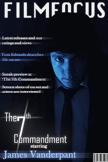
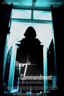
After conducting a large amount of research on the horror genre and the conventions of this genre, I was able to widen my knowledge on the typical conventions and features within this genre, which I then put to use to create a film trailer, film poster and magazine cover using these conventions. I feel that I have succeeded in making a film trailer by following these conventions. For example we did not use a voice over, we decided to use captions instead, i felt that this added to the tension and made the trailer more mysterious. I also believe that our trailer will attract the our target audience as the slow editing used at the start of the trailer helps to build up tension and suspense for the climax at the end of the trailer when the editing . I believe that our trailer does not give away a large amount of the plot which I have also found to by very common in trailers in this genre. The music also followed these conventions as it begins with a piano with a slow tempo, which then cuts to a piece of music with heavy drums, this alerts the viewed of the turning point in the trailer where the action begins. The magazine cover consists of 1 main photo, this photo is of the main actor. This is very typical in movie magazines as they have to draw in the desired audience, making them want to know more about the film, therefore purchasing the magazine. By using interesting articles and including special features about new and upcoming films, this helps to attract the target audience, however it also helps to bring in a wider audience. The poster also has one large photo covering the background. When researching into horror film posters I found this to be very common as this makes it the main focus of the page and attracts the audience's eye. The main text and logos used are placed at the bottom in order to stop interference with the main image. The actors names have been placed at the top of the poster, this means that the audience will automatically be drawn to this as it is separate from the other features making them want to know more if they are fans of these particular actors. The position of the title is towards the bottom of the page and does not distract the main image, however the audience will be drawn to this as the it is quite large and stands out on the dark background. These two ancillary texts are shown below:


  • How effective is the combination of your main products and ancillary texts?
By being consistent and using similar features throughout our media products we were able to create a ‘synergy’. This gave the audience a very strong recognizable link between each product. For example: we used the same font for the captions and the title of the film. We also used the same colour scheme throughout our products, this allows the audience to recognize what film the product is advertising at a glance. It is important for an audience to notice these links as this will help reinforce the idea of a synergy, helping to gain a wider audience and cementing the film name and features in their minds. I think that we have been very successful in linking our ancillary texts with our trailer and in creating a strong synergy throughout.

  • What have you learned from your audience feedback?
After showing the film trailer to members of the audience, along with the poster and magazine cover, they had given me some feedback on what they thought worked and what didn’t. By making a horror film trailer it was crucial that my target audience could immediately identify the genre of the trailer. Every member of the audience was able to pick up on this right away because of the music and the scenes featured in the trailer. Using dreary, dark lighting also helped to reinforce the genre of the trailer. By using a fast paced song towards the end of the trailer, the audience stayed interested the whole way through the trailer, which would help attract a wider audience in the real world. By using the music to help build suspense my target audience had told me that this was very well done as it did give them a slight clue that something was about to happen. From asking my target audience for their views I was able to clearly identify which features worked well and which didn’t.
  • How did you use media technologies in the construction and research, planning and evaluation?
To get the footage for the film trailer we used a high quality video camera and a tripod to make sure that the shots were clear, precise and steady shots. We used Premiere Pro to edit our trailer. We uploaded our footage and then used the best shots, by using this software we were able to use special effects on our shots and the transitions. We were also able to to insert still titles, these were very useful to us as we could insert captions to act as the narrator instead of having a boring, stereotypical voiceover. With the research and planning stages the main source used was the internet, I researched film trailers through YouTube, I noted the conventions they followed and how the trailers were set up, the pace of the film trailer was important, as well as locations, characters, mise en scene and setting. I researched film posters and film magazines through Google and the IMDB, I looked out for key trends between the posters and magazine covers in the horror genre in particular as it was most relevant to our project. With the evaluation stage the main media source was the Internet using YouTube to broadcast our final film trailer and then by using the embed code to paste it on our blog for final feedback.

Tuesday, 15 December 2009

Final Products

Film Trailer


Magazine Cover

Poster

This is the final version of our film poster, as you can see we have made a number of changes since we first obtained this photograph. We added a new title which will be used on all three of our media products, this has a slight blur to it that gives it a ghostly feel, again appealing to our genre. We have used a consistent font colour throughout this poster, this is because we believe it contrasts well with the background colour and stands out well. We have also enlarged the size of the tag-line, this is because it was very difficult to see as it was previously and didn't fit in with the other proportions of our poster. We have also added in the text, "In Theaters February 25". We did this to fit the conventions of real film posters, this simply allows us to give our poster a much more professional and realistic feel to it. We have also added in details about the directors, editors, actors and production studios involved in making the media products. We did this, again, to make our film poster look more realistic and more professional. We have also added the names of the actors to the top of the poster, this acts as a kind of skyline. This again appeals to the conventions of our real film posters and utilises the un-used space at the top of the photo. This is so the image does not look empty.

Monday, 14 December 2009

Narrative Theorists


Vladimir Propp
Vladimir Propp developed a character theory for studying media products such as
books, television programs and films, which says that there were 7 main character
types in the stories he studied, these findings can be applied to other media such as
our film trailer.
These 7 character types were:
  • The villain, who struggles to compete against the hero.
  • The donor, who prepares the hero or gives the hero some form of object to help them on there way.
  • The helper, who assists the hero in the quest.
  • The princess, the person the hero marries, often looked for during the narrative
  • The princess's father, who the hero must impress in order to win the princess.
  • The dispatcher, the character who sends the hero off.
  • The hero reacts to the donor, accepts help from the helper, weds the princess and ultimately defeats the villain.

  • Propp also stated that any story followed a strict pattern of functions, he states that there are 31 of these functions, they are:

  • Absentation
  • Interdiction
  • Violation of Interdiction
  • Reconnaissance
  • Delivery
  • Trickery
  • Complicity
  • Villainy and Lack
  • Mediation
  • Beginning Counter-Action
  • Departure
  • First Function of the Donor
  • Hero's Reaction
  • Receipt of Magical Agent
  • Guidance
  • Struggle
  • Branding
  • Victory
  • Liquidation
  • Return
  • Pursuit
  • Rescue
  • Unrecognized Arrival
  • Unfounded Claims
  • Difficult Task
  • Solution
  • Recgnition
  • Exposure
  • Transfiguration
  • Punishment
  • Wedding/Victory


  • Tzvetan Todorov todorov.jpg

    Tzvetan Todorov simplified narrative theory while also allowing a more detailed understanding of media products with his idea of Equilibrium and Disequilibrium.

    His theory:

    • The media piece starts with a state of equilibrium, where everything is as it should be.
    • It then suffers some disruption, this is the disequilibrium of the piece.
    • New equilibrium is produced at the end of the story-line and normality is restored.
    Todorov also states that there are five stages the narrative of a story can progress through, these are:

    1. A state of equilibrium (All is as it should be.)

    2. A disruption of that order by an event.

    3. A recognition that the disorder has occurred.

    4. An attempt to repair the damage of the disruption.

    5. A return or restoration of a NEW equilibrium


    Editing

    This is by far the most time consuming section of the whole project. This is because we have to look at all the footage we shot and pick out the best pieces to go into our final film trailer.
    After filming all of the footage that we required, we uploaded all of the footage from the video camera onto the media department's iMacs. We are using a program called Adobe Premiere Pro to edit all of our footage. This is a very technical piece of software and allows us to place lighting effects and different transitions between each shot, such as a crossfade and fade to black. The main part of the editing process is cutting a placing all the shots we need, we did this with the "razor" tool on the program. This allows us to cut out what we didn't need and edit the shots that we wanted in our final trailer. Using the software we added our soundtrack and made sure that it was all in time with the shot transition using the select tool. We then created our own title shots with a sentence about the film on each one. We did this by using the built in title editor to choose the colour of our background and the colour, font and general style of the text. We then placed our chosen shot transition effect, dip to black, on a majority of our shots to make the trailer flow smoothly.

    Friday, 11 December 2009

    Filming Timetable

    Filming Timetable height="500" width="100%" > value="http://d1.scribdassets.com/ScribdViewer.swf?document_id=23978092&access_key=key-1qa9tiqo7lc7ve6qyvlm&page=1&version=1&viewMode=list">            

    Thursday, 10 December 2009

    Film Noir Influences

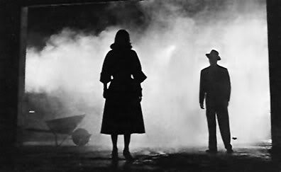
    Our film trailer is very dark and mysterious, the lighting is very dreary and dull throughout many of the shots. These are typical conventions of Film Noir. We have purposely darkened some of our shots to give them a film noir feel, for example we have a shot in which the killer is shown as a reflection of a silhouette. This silhouette is very typical of a film noir film as this convention is used in many of these films.

    Photobucket

    The photo above is a screenshot from a scene in The Big Combo, this is a perfect example of the silhouette shot. This shot has been very influential in many films including ours. This is because the silhouettes look mysterious and they are two very clear figures. This allows the viewer to clearly see some of the features of each figure, but are unable to see some more important details, such as the face. This leaves us wondering why these two people are in silhouettes and what reasoning is behind this. This is how we would like to portray our killer in our trailer, but instead of so mysterious we were looking to portray him as more scary and creepy in order to emphasise the genre of our film.

    Friday, 4 December 2009

    Mood Board

    We made this mood board to show some of the movie posters that gave us inspirations and ideas to add to our movie poster. These films are also relevant to our trailer as they are all of the horror genre and our trailer contains the same characteristics.

    Wednesday, 25 November 2009

    Film poster image - Before and After

    Before
    This was the image we decided to use for our film poster. We decided we need to change a lot of the feature in this image, such as the lighting, colour of lighting and shadows. The colours in this image are not very suitable for our image, the colours in this image are mainly browns and yellows, more neutral colours. This does not fit in very well with our film genre, horror. Also we were not happy with the face of the character as he does not look very mysterious. This means we will have to heavily edit this image to get the end result we are looking for.

    After
    As you can see we have heavily edited this photo to make it fit our genre and suit the themes of our film. We first changed the contrast, hue and gamma levels of the image to hide the features of the figure. We then set about changing the colour of the lighting, we decided to change the lighting from a dingy yellow to a dingy blue. We did this by placing a blue filter over the image, this changed all of the neutral colours to colours that are more associated with the horror genre, such as blues, blacks and whites. This gives the image more eary feel, which strongly hints towards the genre of the film. We believe that this image is very good as the lighting and location are excellent and the fact that you are unable to make out the figure's face makes the whole image very mysterious. We are very happy with the end result of this editing and we are going to use this image as the main feature of our film poster.

    Decisions during film poster production


    These screenshots show two versions of our film poster, each one is slightly different in terms of layout and general positioning. The first image directly above shows our first idea, this is a very conventional film poster with the title centralized at the bottom of the image along with a small tagline and the actors names. We decided to go with these conventions and we believe it suited our main image as is blended in well with the colour scheme and didn't interrupt anything in the background. In this image we have the tagline over two separate lines. This allowed us to centralize the text. However we weren't very happy with how this looked as we believe it made this area of the poster look almost untidy.
    However, the only issue we cam across with both of these images was that the similar layouts left a large empty gap at the top of the poster. We tried placing the main heading, tagline and actors names in this gap but we were not happy with how it looked. We then moved the heading and tagline back to where they were originally and placed only the actors names at the top. This also match conventions of other movie posters and the text acted as a "skyline". We believe that this has made our piece look a lot more professional and looks of quite a high standard.


    This second image has the same general layout as our first image, apart from a few minor changes we made to the location of the heading. We have moved the heading further up the image as we decided to place production company logos at the very bottom of the image to match further conventions of existing movie posters. Another change we made was to have the tagline all on the same line. We were very happy with how this looked and have kept it this way. This is simply because it makes this area of the image look more neat. We also believe that it makes the whole piece look more professional and is similar to existing posters we have seen in magazines and in local cinemas.

    Tuesday, 17 November 2009

    Photos

    Photobucket
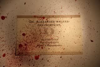
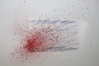
    This was our first attempt at photographing our business card, as you can see we used the same spray technique as we had practiced. This proved very successful as we all agreed that it was the right technique for the job in hand. We also used a different lighting source and this also proved very successful. This is because we got a yellow, dingier light. This added to the eary theme of our magazine cover. We all agreed that we'd use this light source again as it proved to look more unique and had a professional look to it.


    Photobucket
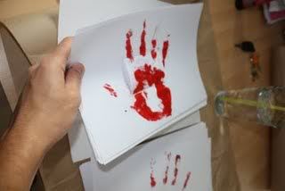
    We then experimented with different techniques and patterns, we tried a "bloody handprint" technique, as shown above, to give the image a more sinister feel. We felt however that this wasn't very effective as we were unable to get a finish of an acceptable quality. We therefore decided not to use this technique and to stick with using the spray finish we perfected previously.


    Photobucket
    Before we jumped right straight into spraying paint onto our prop business card, we decided to use a mock card as a tester. This proved to be very useful as we perfected the technique of effectively painting the card to make it look like blood splatter. However we did find a few imperfections in this method, one of them being it looked quite bare and very bright. So we chose to darken the whole image and use a dingier light source to give it a slightly eary feel.


    Photobucket
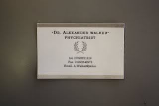
    This is the business card we designed and printed to use as the main item in our magazine cover, we chose to use a business card as it contrasts with the dominant "Psychotic Killer" theme of our film. This shows the name and profession of our main character, this shows his professional side as opposed to his "alter-ego".

    Tuesday, 22 September 2009

    Intro

    For my A2 Media Studies coursework I am going to make a film trailer for a horror film. I have decided to make a film trailer as the film industry is something in which i have a lot of interest. I am keeping this blog as a diary of all the progress of my project. This will include film trailers that relate to my project and various film posters.

    Wednesday, 16 September 2009

    Film Trailers

    I have posted these videos onto my blog
    as i feel they are highly relevant to the
    film trailer i am going to be making.
    This is because they all fall under the same
    category, horror. I will be taking conventions
    from trailers such as the ones shown below, and
    putting them into my trailer to make it fit the
    genre and look highly professional and well made.


    Tuesday, 15 September 2009

    Film Posters

    Photobucket


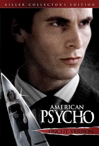
    I chose this film poster to analyse as it has a very similar to the film we are producing a trailer for. This poster has provided us with a great deal of inspiration and ideas for our own film poster. The representation of the main character is very similar to the representation we would like to portray our character in. The character is dressed in a smart suit, shirt and tie. This shows us that he is a working professional and seems to have class. This makes us assume that he is a business man and has a good job. However this is then contrasted by the knife he is holding in his hands. This shows us that he is more sinister than we first expected and suggests he has a much darker side to him. Also the reflection in the knife is of a woman, this tells us that his victims must be predominantly women. This is a typical convention of a "slasher" movie as women are usually portrayed as being helpless and unable to save themselves. Whereas men are either portrayed as being the heroic character that always seems to save the day and put things right, or the killer who normally preys on the helpless women and it the most dominant figure in the film. This is the portrayal we are looking to use for our main character in our film


    Photobucket


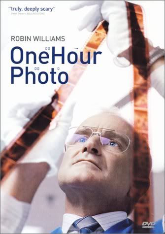
    I chose this film poster to analyse as the main character, shown in the film poster, is portrayed as being creepy and mysterious. This is relevant to the film trailer we are currently making as our character is also a creepy, stalker-ish person. In this film poster we are unable to tell the genre of the film as it just shows who we assume to be the main character doing his job, processing photos. This again uses the conventions of American Psycho by contrasting the professional side of the character with the psychotic side of the character. This is very good as we can assume two things when looking at this poster, firstly that he is a normal man doing his job, or secondly that he is a stalker that takes photos of his victims and uses the cover of his job to make it less obvious. This leaves the audience wondering what is the correct portrayal of this man and they are likely to go and see the film to find out.